
It has a shaky reputation and attracts debate; its purpose is often misunderstood; and its proponents even mischaracterised as anti-realists. I think I need to explain modulation…
Modulation is not a single style. It’s really an umbrella term for lightening and darkening colours on different surfaces of a model or figure, primarily to represent light and shadow. The aim is to enhance the three-dimensionality of a subject by distinguishing its volume and shape, which tend to diminish with scale.
So if you’ve ever shifted the lightness of a colour to recreate light or fill in a shadow, you’ve “modulated”.
However, the style most associated with modulation involves painting each major surface with a gradient, the direction of which differs between adjacent panels so that edges are emphasised by contrast. This goes beyond light and shadow and becomes an artistic treatment.
For some modellers, this crosses the Rubicon. Consequently, this unnatural look has become the rebellious poster child of modulation and is subject to vehement criticism by some conservative traditionalists who, perhaps, have never looked beyond it and so they tar the whole topic with the same brush.
I’ll point out that this is far from being the most common type of modulation, nor the most effective. There are several more naturalistic variations, most of which have a realistic intent, and it’s those which I’m going to try to explain as a counterpoint to modulation’s bad reputation.
What this article isn’t
It’s not a style guide. The only subjective advice which I’m going to give you is that you’re free to develop your own style and it can be as extreme or high-contrast as you dare to go, or so subtle that only the most observant viewer will realise why your model looks more lifelike. You do you, as the t-shirt says.
Nor is it a how-to guide to colour theory. Altering the lightness of a colour without excessively shifting its hue or saturation isn’t exactly straightforward, so it’s a topic which deserves its own article and will have one soon.
It won’t give ready answers to criticism. I started listing objections and refutations before realising that this, also, is a bit beyond the scope. If you’re reading this, you’re probably open-minded to the idea and you just want to know what it’s about, so let’s stick to that. Maybe, to sway the sceptical, I’ll advocate for modulation some other time.
I also tried Blender with the idea of making some simple 3D renders to show you how the different modulation styles work, but I hit my limit in digital design! I may return to that one day…
Time to tackle the tricky topic of terminology
First up, the M-word itself. Quite apart from the aforementioned negative connotation, I don’t think that it’s the most useful descriptor.
A lot of painting terms in modelling are borrowed from art or design along with the concepts which they describe, but modulation is an exception. I know this as rendering, which means the use of colour and shading to make an artwork appear three-dimensional. However, modulation has become established so let’s stick with it.
I found it quite challenging to name and define the various flavours of modulation and make tidy distinctions between them, so it would be no surprise if modellers are not all on the same page here.
I settled on a categorisation which makes sense to me and I’ve preferred what I think is widely recognised (or at least recognisable) and unambiguous terminology with a minimum of jargon. If you asked someone else to write an explainer, they may come up with a very different answer, but there are no rules here and my take isn’t intended to be taken as definitive.
Chief among my sources is “Modulation and Light Techniques” by Javier Soler so if you get to the end of this guide and you’re none the wiser, at least it’s not all my fault. 🤭 If you find a copy of this book, grab it because it's really good.
Variation per panel
Surfaces vary in lightness, but the key here is that each surface is monochromatic (ie. a single colour) rather than gradated. This style doesn’t imply a real light source; the intention is simply to use variation to emphasise shape and volume, thus creating that three-dimensional quality.
It’s at least a step towards realism from the popular image of modulation. You could file this in the same pigeonhole as panel line shading in the sense that it adds tonal variety, but not necessarily with a solid basis in reality.
Zenithal light
Zenith (Astronomy)
The point in the sky directly above an observer; the highest point reached by a given celestial object.
Surfaces vary to represent daylight from directly above (hence “zenithal”). Flat surfaces are mostly monochromatic, while curved surfaces usually have a gradient corresponding to their curvature. Some modellers may also use gradients on large vertical surfaces to represent oblique light.
This is a more naturalistic style. Like variation per panel, it creates a three dimensional quality, but does so based on reality, ie. what a real vehicle tends to look like in typical daylight. In this way, it’s in line with the viewer’s expectation.
This is my usual style, so you can judge for yourself whether it succeeds in making a model look a bit less like a model.
Source lighting
One or more directional light sources are envisaged and the model’s surfaces are painted to, literally, reflect them. The source could be angled sunlight on one side of the model, street lights, glowing fire light, sharp window light, or even the extreme effect of a single torch light surrounded by shadows.
This takes zenithal light and dials the realism up a notch or two by telling the viewer something about the model’s imagined surroundings, whether it’s displayed on a shelf, terrain, or diorama.
Object-source lighting (OSL)
This is the strict version of source lighting which requires that any light source is actually modelled in the scene rather than being implied by the rendering alone.
Both source lighting styles, and especially OSL, are most associated with figure painting. But they also add verisimilitude to models and other elements in dioramas or vignettes. Figures around a fire, a building lit by moonlight, a vehicle under the shade of a tree… you get the idea.
So far, I’ve covered what could all be classed as “macro” styles because they are mostly applied on a large scale over the whole model. There’s also one distinctly “micro” style which represents highlights and shadows on a small scale. And that’s…
Detail enhancement
High spots and details are picked out with a lighter colour than the surrounding area, while recesses and corners are shaded. This could look a little out of place on its own, so it’s often combined with one of the macro styles, or used to enhance a camouflage scheme. Adam Wilder and Martin Kovac have used detail enhancement in that way.
Camouflage
I get the impression that modulation is so closely associated with monochromatic paint schemes that some modellers may overlook it as an option for camouflage. There is nothing, other than the challenge of more paint mixing, to discourage you from painting a multi-colour scheme using any of these styles.
The TLDR
Modulation itself is not so much a style — certainly not one style — but a technique. You can take the fundamental idea of altering lightness, add some imagination, and run with it. Do whatever suits your intent, whether that’s subtle, physics-based, artistic, high-contrast, or something in-between. Don’t think too hard about what to call it while you’re doing it, and if you share it on the web, don’t feel disappointed if you get a curmudgeonly harrumph from someone who just doesn’t get it! 🤷🏻♂️
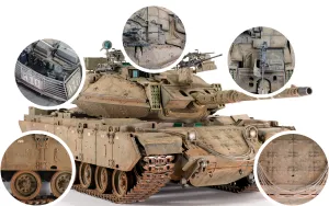
Thumbnail image credit: M4A2 render created by barking_dogo at Sketchfab


Add your comments